To help with this project, I researched and referenced poster work by different artists in relation to rock music. Whilst this helped, it also made me try to create some over-complicated work to reply to the brief I had set myself.
So, onto the progression.
(note: To not take up too much space on this blog, I'm using smaller thumbnails than I would like. Simply click on them to be taken to a larger version on flickr).
Poster No.1

This was my first attempt at seeing what I needed to put on the poster for it to work as a tour advertisement. Obviously, i've created a creative faux par by using a photocopier and adhering to the punk asthetic (which I am trying to avoid) but it did help me to see how I needed to layout my poster, and the information that would be stored on it.
Poster No.2
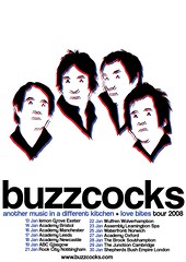
This was the next version I created. I was interested in the idea of 3d pictures, and even though it wouldn't work as a proper 3d picture, I liked the bold colours so I knocked together a drawing of the bandmembers and used a free version of Helvetica as a basis for the text. It is a bit bland, and to quote my tutor "I love The Buzzcocks, but you'v emade a poster that makes me NOT want to see them!". It needed a lot of work.
Poster No.3
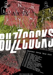
This was the third revision. I had a book about arial photography, and I wanted to use it in my work somehow so that is what the background collage is based around. I also added the figures in to add another dynamic to the image, and went for a plain set of colours to tie the whole thing together. Whilst I think it's a vast improvement on the first set of posters, It was becoming too overcomplicated with all the elements vying for dominance. I decided at this point to spend some time away from this project, and focus on something else so that I could come back with some fresh ideas.
Poster No. 4 & 5
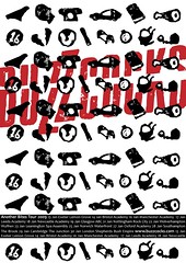
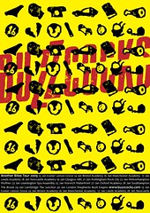
When I returned back to the project, I had found a new idea when talking to one of my tutors in a crit. The idea was simple: since this tour is about the band playing their first 2 albums, why not make small graphic elements of some of the songs that were in the setlist. I dug out the lino cutter and printed some small graphical representations of the songs, and then came up with this poster idea. It's simple, get's the message across and it's not overcomplicated. I'm yet to decide on a background colour, but yellow is favoring me at the moment so I think I shall utilize it in some sense.
I hope this was an insight into the method of working I use, and hopefully the choices that need to be made when revising designs